


.webp?width=200&name=Frame%202608526%20(1).webp)

-1.png?width=1812&height=1072&name=TripAdvisor%20%26%20More%20Bookings%20(1)-1.png)
-2.png?width=1812&height=1072&name=Google%20Bookings%20(1)-2.png)

.png?width=200&name=Google%20reservations%20(1).png)
-1.png?width=200&name=TripAdvisor%20%26%20More%20Bookings%20(1)-1.png)
-2.png?width=200&name=Google%20Bookings%20(1)-2.png)
-1.png?width=200&name=Instagram%20Bookings%20(1)-1.png)
-1-png.webp?width=200&name=Facebook%20Integration%20Rectangle%20(1)-1-png.webp)


.webp?width=200&name=download%20(1).webp)
%20(1)-2.webp?width=200&name=Eat%20(34)%20(1)-2.webp)
%20(1)-2.webp?width=200&name=Eat%20(18)%20(1)-2.webp)


Each year, we compile a list of our favorite great restaurant websites, evaluating them based on overall design, attention to detail, and the unique features that restaurants use to make a strong first impression in 2025.
If you are wondering how to make a restaurant website, these examples should help you clarify your idea.
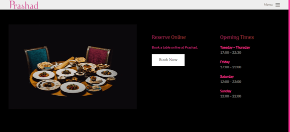
1. Prashad, England
.webp?width=580&height=293&name=download%20(19).webp)
I love how Prashad's website puts everything front and center – from their award-winning menu to their story. It’s easy to navigate, making it a breeze to book a table or grab their cookbook with just a few clicks.
The design keeps the focus on the food and the restaurant’s heart, featuring mouth-watering images and clear menu listings. Plus, the ‘book now’ button is right there on the homepage, making it simple for visitors to take action.
2. Brasserie Blanc, UK
.webp?width=580&height=313&name=image18%20(1).webp)
Brasserie Blanc’s website is easy to navigate and serves multiple UK locations with clear prompts at the top. It covers everything you need: book a table, select a location, sign up, and follow them on social media. There are also quick links to menus, private dining, vouchers, and events. The site showcases Raymond Blanc's culinary ethos with great visuals and content. Plus, as a member of the Sustainable Restaurant Association, it includes info about suppliers and food seasonality.
3. Simon Rogan Restaurants, UK
.webp?width=580&height=313&name=image19%20(1).webp)
I really like Simon Rogan’s website. It serves as a hub for all his restaurants, with the brand’s identity shining through. You can easily select a venue by clicking on its logo, which then takes you to content specific to that location.
The design is clean and eye-catching, with prominent call-to-action buttons. Booking a table, room, experience, or buying vouchers is simple and mobile-friendly. The navigation is clear, and footer and header links lead you to additional features like the contact page and shop.
4. The Black Swan Oldstead, England
%20(1)-2.webp?width=580&height=500&name=image3%20(5)%20(1)-2.webp)
This Michelin-starred pub with rooms in North Yorkshire, England, resembles a glossy food magazine, but it’s fast-loading and straightforward to navigate. The website effectively engages website visitors with its intuitive navigation and clear presentation of information.
Click on the food page, and this restaurant has its menu information right underneath the Book Now button. It would be even better if the site didn’t rely on clicking a PDF for menu inclusion.
5. Temper, England
.webp?width=580&height=256&name=image26%20(1).webp)
Temper’s home page showcases this mini-chain’s eating vibe and food. Location, reservations, events and contact details are easy to reach from the main navigation.
Creating your own restaurant website can provide a seamless and efficient experience for customers, as demonstrated by Panini Bay's site. To get to the food menu, you must select a specific location, but when you do, the sample menu is on the page.
6. Panini Bay, New Jersey, US
This Italian restaurant’s website really stands out with its light, clean design and coastal vibe. It feels relaxed and uncluttered, and the mobile version is just as great. Scrolling down, you’ll find links to the menu, the chef’s story, and reservations.
Like Big Gay Ice Cream’s website, it uses vibrant imagery and engaging content to grab attention. The contact details and directions are conveniently in the navigation menu, which is a great touch for anyone in a rush. It makes you expect top-notch customer service to match the seamless website experience.
7. The Ivy, London, England
.webp?width=580&height=241&name=image21%20(1).webp)
The Ivy’s website is sleek and modern, much like the restaurant itself. The site features stunning scrolling imagery of the restaurant’s interior, food, and drinks, creating an inviting atmosphere.
%20(1)-2.webp?width=580&height=281&name=image1%20(6)%20(1)-2.webp)
As you browse, you'll see options like booking a private dining room or buying gift cards, with clear calls to action. Even if you’re having trouble finding something in the main navigation, chances are it’ll pop up on the screen quickly. The opening hours are easy to find on the homepage, so you don’t have to look far for the info you need.
8. Via Real, Texas, US
.webp?width=580&height=265&name=image27%20(1).webp)
This website for a Santa Fe-style restaurant in Irving, Texas, is simple but effective. The clear navigation bar makes it easy to get around, and I love the prominent 'Book a table' button right under the word 'Welcome'. All the information you need is just a click or two away.
.webp?width=580&height=248&name=image28%20(1).webp)
If you scroll further, you'll find beautiful photos of the restaurant’s interior and food, plus details about the owner. You can also buy a gift card or sign up for the newsletter. At the bottom of the page, there’s a collection of menus to help you pick your next lunch, dinner, dessert, or drink.
9. Yang's Kitchen, California, US
.webp?width=580&height=513&name=image23%20(1).webp)
Young's Kitchen serves Asian American cuisine. The restaurant, located in Alhambra, California, relies on seasonal produce from local farmers. It also offers a variety of gourmet drinks like hot coffee, tea, wine, beer, sake, mimosas, and cocktails.
The site could inspire lovers of minimal design. With plenty of white space, it features only a few images.
At first glance on the page, you get all the information you might need: The location, the opening hours, contact details. The clean design allows you to find additional facts about the restaurant.
You can learn that:
- They are a Zero Foodprint member
- They have an online ordering system
- You can join a brunch or lunch waitlist
- You can purchase a gift card
When you navigate towards the top right-hand corner and click on the "View Our Menu" option, you can feel like you are in the restaurant, holding a physical menu.
.webp?width=461&height=450&name=image29%20(1).webp)
Again, the layout is very clear, with all the dishes and beverages listed in columns, just like printed restaurant menus usually present them.
10. The Clove Club, London, England
.webp?width=580&height=265&name=image25%20(1).webp)
The Clove Club’s website takes a unique approach to minimalism. When you first visit, you’re greeted with a simple blue screen. The restaurant’s name is in the center, with a ‘Reservations’ button on the right and a mysterious plus sign on the left. After a moment, an animation of a plant slowly grows behind the name, presented in an old movie style. It’s captivating and gives you a taste of the venue’s elegant, vintage-inspired atmosphere and fine food.
Clicking the plus sign opens up more details about the restaurant, including information about the owner, menus, contact details, gift vouchers, and job opportunities. It’s a fresh, inspiring design that stands out.
11. Bon Bouquet Café, Paris, France
%20(1).webp?width=580&height=267&name=image15%20(2)%20(1).webp)
If you’re tired of minimalist websites, Bon Bouquet Cafe offers a vibrant, colorful contrast. The homepage greets you with a neon sign, setting a lively tone. As you scroll down, mouth-watering images of delicious food catch your eye, tempting you to visit right away.
The pictures showcase the creativity of the chefs, offering a Bali-style brunch in the heart of Paris. Keep scrolling, and you’ll find a detailed menu with all the brunches, desserts, and drinks available at the cafe. Further down, you’ll see the opening hours, the address, and the tram routes that can take you there. At the bottom, you can even explore the cafe’s exterior via Google Street View. It’s all the info you need to discover Bon Bouquet Cafe for yourself.
12. Disco Cheetah, Vancouver, Canada
.webp?width=580&height=256&name=image17%20(1).webp)
Though simple and with a clearly defined color palette, Disco Cheetah’s page offers one of the most outstanding restaurant website designs. Fonts, colors, images, and other design elements remind you of the '80s style and show that this is a place with character.
Intuitive navigation and tiled layout enable finding the key information quickly, inviting potential customers to visit this Vancouver-based fast food with Korean dishes.
Fun fact: The business started by selling burritos and tacos from a trailer. Disco Cheetah still has a food truck that serves meals at different locations in the city and is available for booking.
13. Canlis, Seattle, Washington
%20(1)-1.webp?width=580&height=264&name=image10%20(4)%20(1)-1.webp)
Delicious food is a major draw for any restaurant, but if you have something extra special, it’s worth showing off. The owners of Canlis Restaurant in Seattle know this well. Their landing page features a full-screen video showcasing the restaurant’s stunning location on Queen Anne Hill.
The view is incredible, making you imagine spending hours in this mid-century-modern building, enjoying great food while taking in the scenery of Lake Union and the Cascade Mountain Range. With breathtaking views, exceptional service, and a unique dining experience, Canlis truly lives up to its reputation as one of Seattle’s best restaurants.
14. Jack Bar, London, England
%20(1).webp?width=580&height=264&name=image12%20(2)%20(1).webp)
Can you create a fantastic restaurant website with a popular website builder? You surely can, and Jack Bar's webpage proves that.
This one-page website created on WordPress offers distraction-free access to all the basic information. Apart from locations, opening time, and contact info, you'll also find the bar's story and a button for booking an area in the bar, which undoubtedly helps the owners maximize the revenue from the floor plan.
Besides inviting images of the restaurant's interior, the site also features beautiful food photos. All of that makes a compelling invitation to this London-based bar.
15. Desert Chill, Dubai, UAE
%20(1)-2.webp?width=580&height=261&name=image2%20(5)%20(1)-2.webp)
Desert Chill has the best restaurant website to attract kids. Its bright colors and typography create a fairytale-like atmosphere and make you assume that the Desert Chill soft truck is where Barbie would buy her ice cream. In other words, it's a great example of a well-targeted website design.
16. La Pierre Qui Tourne, Coloisy, France
%20(1)-1.webp?width=580&height=255&name=image4%20(5)%20(1)-1.webp)
We went through videos, animations, attractive photos, neon lights... What else could you use to advertise your restaurant online? How about hand-drawn images? La Pierre Qui Tourne is a restaurant that effectively uses them in its website design.
When you browse through the site, those fabulous images attract the eye and reflect the unique character of the place. It's created by a French couple who bakes biscuits from natural ingredients.
Each biscuit is named after a different animal, and seeing how they are interestingly depicted encourages you to know them better...
17. Cluny, Toronto
%20(1).webp?width=580&height=314&name=image14%20(2)%20(1).webp)
This Toronto-based bistro has a website that makes a great first impression by showing off its elegant and intriguing interior in a full-screen video. Plus, the original logo and hand-drawn images make this website a real piece of art.
Two simple buttons are prominent in the right-hand corner – 'Takeout' and 'Reserve.' The first directs you to the takeout menu, and the other allows you to book a table online.
18. Red Bamboo, New York, US
%20(1)-1.webp?width=580&height=267&name=image7%20(5)%20(1)-1.webp)
Red Bamboo’s website has a clean, atmospheric design with a white background and mouth-watering photos of their treats. The simple yet effective logo in the header immediately catches your eye.
The most important information – the restaurant's address – is conveniently placed at the top of the menu bar. Clicking on it gives you more details, along with links to a subway map and Google Maps.
Scrolling down, you’ll find more about the restaurant, including its opening times, phone number, and third-party food delivery options. The site features clear call-to-action buttons like 'Order Now' and 'Order Pickup.' You’ll also find positive reviews from trusted sources like Yelp, TripAdvisor, and Happy Cow, along with video testimonials and Red Bamboo’s Instagram feed.
19. Añejo Mexican Bistro, Hyannis and Falmouth, US
.webp?width=580&height=263&name=image24%20(1).webp)
Restaurant websites usually showcase interiors with empty tables, but Anjelo doesn't shy away from showing their restaurant when it's full of people. It proves it's a place with a climate. And you can read from the photo that people like hanging out there.
What immediately draws your attention in the header photo is a huge, beautiful, rank tree with bent branches. It's a weeping beechtree, that is almost 250 years old – it was planted in 1776. A unique feature that became a hallmark of the Hyannis restaurant.
When you browse through the page, you learn that the interiors of this Mexican restaurant have an exceptional, rich, but tasteful design. The photos are excellent. Angelo knows how to make their website inviting.
20. Ask for Luigi, Saint Alexander, US
%20(1)-1.webp?width=580&height=265&name=image11%20(2)%20(1)-1.webp)
Ask for Luigi is an Italian restaurant offering family-style service. The dishes there arrive in the middle of the table, ready to be shared among the diners.
You can read from the photos and hand-painted image on the main page header that this place has a homey atmosphere and a dose of vintage vibe. Even the numerous CTA buttons have a retro frame.
%20(1).webp?width=580&height=244&name=image13%20(2)%20(1).webp)
The site has an aesthetic color palette with dominant brown and white shades. And you cannot miss a great Michelin review below the header image. It builds trust that you can enjoy a positive taste experience at this place.
21. Fable Ice Cream, Saskatoon, Slovakia
%20(1)-1.webp?width=580&height=313&name=image6%20(5)%20(1)-1.webp)
Here's another restaurant website design with images taken from a fairy tale, this time in black and white. Beautiful animals from a magical forest stress the ice cream shop's connection to nature: They use only natural ingredients from local farmers and producers.
You can check all the currently available flavors on the webpage. The simple design uses a dose of color in the final section, where you can find a photo gallery from Fable Ice Cream shop.
22. Yang's Place, Ringwood East, Australia
.webp?width=580&height=231&name=image20%20(1).webp)
Young's Place again proves that simplicity in restaurant website designs has a strong appeal. The blue drawings at the top of the page remind you of patterns on Chinese porcelain – a clever move for a restaurant serving traditional Chinese cuisine. Blue is the color that appears on different images on the page, giving them a nice frame.
.webp?width=580&height=269&name=image30%20(1).webp)
Below the header image is a tiled layout of some great food photos mixed with links to subpages like ‘Order Onlne,’ ‘Menu,’ or ‘About Yang's.’ The clean design helps to focus on the most essential information on the website.
23. The Lost Kitchen, Freedom, US
%20(1)-1.webp?width=580&height=347&name=image5%20(7)%20(1)-1.webp)
If you are interested in hotel restaurant management, the simple but charming design of the Lost Kitchen’s website might be something for you.
The place's name and beautiful photos capture the character of this place – a quiet spot where you can relax, forget about all your problems, and recharge your batteries.
Although the owner, Erin French, has become a renowned personality, and the website communicates that she also sells her sought-after books and runs a small goods shop, the webpage is still beaming with peace.
24. The Original, Denver
%20(1).webp?width=800&height=415&name=43161The_OG_Denver_BRW21%20(1)%20(1).webp)
The Original, a beloved Denver-based diner from Sage Restaurant Concepts, was created with the idea of reinventing the local hangout spot. This neighborhood eatery delights diners with its creative twists on classic dishes.
Their website does an excellent job of bringing the restaurant experience online, featuring quirky illustrations of malts and T-bone steaks that add character and vibrancy.
The navy border helps keep guests focused as they browse through the menus and explore the latest happenings at the restaurant. The prominently highlighted “Reservations” button is strategically placed to encourage visitors to book a table, turning online visitors into paying customers.
25. High Street Market & Deli, San Luis Obispo
%20(1).webp?width=800&height=415&name=79797HighStDeli2%20(1)%20(1).webp)
Established in 1927, High Street Market and Deli has been a staple in the San Luis Obispo community, nestled between Los Angeles and San Francisco, for nearly a century. Their website is sleek, modern, and impactful, featuring playful and illustrative branding, especially on their menus.
Visitors can easily place catering orders directly through the site. For the most loyal customers, there's also an online store where visitors can shop for a variety of branded merchandise and goods.
26. Anton's, New York
%20(1).webp?width=800&height=415&name=60106Antons%20(1)%20(1).webp)
Anton’s is a charming New York café that honors the city’s rich culinary traditions, improved with European flavors. Their website captures a neo-classical aesthetic, using elegant italicized serif fonts and beautiful photos of their food and interiors.
A side navigation bar makes it easy for visitors to find menus, hours, and press coverage quickly. The site’s highlighted buttons are strategically placed to encourage actions like booking a table or subscribing to their e-newsletters.
27. China Poblano, Las Vegas
%20(1).webp?width=800&height=415&name=39262ChinaPoblano%20(1)%20(1).webp)
Nobel Peace Prize nominee José Andrés has made a significant impact as a chef, restaurateur, author, and activist. José's relief organization, World Central Kitchen, provides meals to thousands in disaster-stricken areas. One of his newest ventures, China Poblano, blends the vibrant culinary traditions of Chinese and Mexican cuisine.
The website reflects this fusion with bright colors and symbolic, textural designs. The Happenings page keeps visitors informed about the latest events at this unique restaurant located in The Cosmopolitan luxury hotel.
28. Francie, New York
%20(1).webp?width=800&height=415&name=65126Francies%20(1)%20(1).webp)
Run by acclaimed chef-owner Chris Cipollone (Piora, Cotogna) and owner-operator John Winterman (Batard, Daniel), Francie is a cherished Brooklyn restaurant known for its approachable yet refined dining experience.
A standout feature of their website is the "Happenings" page, where visitors can buy tickets to unique events like the "Learn How To Make Pasta Like A Pro" class or the "Guest Chef For A Day" experience, offering a behind-the-scenes look and hands-on work in a professional kitchen.
29. Tiki Chick, New York
%20(1).webp?width=800&height=415&name=2997TikiChick%20(1)%20(1).webp)
Tiki is making a comeback, and it's here to stay. Tiki Chick, the latest concept from Pickle Hospitality, has been carefully crafted to offer New Yorkers unique, approachable, and refreshing tiki drinks.
Their website perfectly captures this vibe with vibrant colors and playful branding, whisking visitors away to a tropical paradise that feels both nostalgic and modern. The menus are a highlight, featuring detailed, illustrated depictions of their tiki cocktails that add to the fun and lively atmosphere.
30. Miss Lily's, NYC, Jamaica and Dubai
%20(1).webp?width=800&height=415&name=58790MissLilys%20(1)%20(1).webp)
The vibrant and colorful branding of Miss Lily’s captures the essence of this Caribbean-inspired hotspot online. Known for its eclectic, cool, and welcoming vibe, Miss Lily’s is the go-to place for rum and jerk chicken-fueled events. With easy-to-complete inquiry forms, planning your next island-themed party is just a click away.
Here are the key features every great restaurant website should have:
Clear Navigation Menu: A simple navigation menu lets visitors quickly find what they need, whether it’s the menu, contact info, or reservations.
Prominent Menu Display: Make your food and drink menu easy to find. Include descriptions, prices, and highlight special dishes to draw in potential customers.
Online Ordering System: A secure and easy-to-use online ordering system is essential for takeout or delivery, improving the customer experience.
Reservation System: Enable customers to book a table online through a reservation system. This helps manage traffic and boosts satisfaction.
Photo Gallery: Use a photo gallery to showcase your dishes, interior, and exterior. High-quality images grab attention and leave a lasting impression.
Customer Reviews and Testimonials: Positive reviews build trust and encourage new customers. Include a section where customers can share their experiences.
Special Promotions and Events: Inform customers about promotions and events. This encourages repeat visits and keeps your restaurant in their minds.
Restaurant Story and Mission: Share your restaurant’s story and mission to create a personal connection with your audience and differentiate your brand.
Contact Page: Make it easy for customers to get in touch. Include your address, phone number, and email on a dedicated contact page.
Social Media Integration: Link to your social media profiles to engage with customers and build a community around your brand.
Including these features can turn your website into a powerful tool that attracts and retains customers, driving more revenue.
Mobile-Friendliness and SEO for a Restaurant Website
Having a mobile-friendly and SEO-optimized restaurant website is a must in today’s digital world:
Mobile Usage: Most customers use their phones to search for restaurants. A mobile-friendly website ensures visitors can easily navigate and access your site’s features on any device.
SEO Optimization: SEO is key to improving your website’s visibility in search engines. An optimized site ranks higher, making it easier for customers to find you and visit your restaurant.
User Experience: A mobile-friendly and SEO-optimized website offers a smooth user experience. Visitors can quickly find your menu, location, and reservations, which leads to more engagement and repeat visits.
Increased Sales: A well-optimized website attracts more visitors, converts them into customers, and encourages them to return, ultimately increasing sales.
Incorporating mobile-friendliness and SEO ensures your website is accessible, user-friendly, and visible to potential customers, helping your business thrive.
Online Ordering Integration for a Restaurant Website
Adding online ordering to your restaurant website offers several benefits:
Increased Sales: Online ordering makes it easy for customers to place orders from home, leading to higher sales and more convenience.
Improved Customer Experience: An online ordering system allows customers to order easily, improving satisfaction and loyalty.
Reduced Labor Costs: With online ordering, there's less need for staff to take orders in person or over the phone, reducing labor costs and allowing staff to focus on other tasks.
Increased Efficiency: Online ordering helps restaurants process orders accurately and efficiently, improving delivery times and reducing errors.
Incorporating online ordering into your website is a smart move. It boosts sales, enhances the customer experience, and increases operational efficiency, keeping your restaurant competitive and meeting customer expectations.
Conclusion
When you make your restaurant visible online and create a website with a superb design, you can attract visitors whether your restaurant is located in the center of San Francisco or lost somewhere in the mountains. Just like Erin French's place, it can become a destination in itself.
After you launch your website and welcome restaurant visitors at your door, remember that you can use the Eat App to manage the table inventory, increase reservations, and improve restaurant efficiency by automating your operations.
The platform can help you grow online and foot traffic. You can use it to collect customer reviews and enhance your marketing efforts. Sounds interesting?
Sign up and start for free today.
Frequently Asked Questions about Restaurant Website Designs
Does my restaurant need a website?
According to multiple resources, it's essential for a restaurant to have a website. The great news is, that it doesn't have to cost you a fortune. Multiple site builders offer free templates. In the end, you just need a central place your guests can go to online. Make sure to add your menu (keep it up to date), the time and location of your restaurant, and a button where guests can go and make a reservation.
How many restaurants don't have a website?
A recent study by Restaurant Science, a leading information and analytics provider in the industry, revealed that over half of independent restaurants surveyed don't have a website. Even more surprising, less than 40% have their menus available online.
What is a restaurant domain?
For example, the domain name example.com might correspond to the IP address 198.102.434.8. Domain names like google.com and wikipedia.org are other examples. By using a domain name instead of a numerical IP address, it becomes much simpler to remember and enter web addresses.
What is a menu website?
A website menu is a collection of linked items that help users navigate between different pages or sections of a site. The type of menu used can vary based on the website's content and design.
How do I create a restaurant website?
The simplest way to create a restaurant website is to choose a website builder with customizable templates and drag-and-drop design tools.
Some popular examples include Squarespace, Wix, and WordPress. Select a template, add your content, and customize the design. Remember to optimize the website for mobile and consider adding an online ordering system before you launch it.
How can I design a restaurant?
Designing a restaurant is complex and demanding, so we recommend hiring a professional architect and interior designer with industry experience. It is often well worth the investment. If you want to design a restaurant yourself, consider using a restaurant floor plan creator like SmartDraw, Foyr Neo, or Room Sketcher. The tools can help you visualize and experiment with different floor plan layouts.
What type of website is a restaurant website?
A restaurant website showcases the restaurant's brand, location, menu, and other important information. It aims to attract customers and increase the restaurant revenue.
What do you write in a restaurant website?
When writing content for a restaurant website, include the following:
- Essential information like the restaurant's address, phone number, and opening hours
- The restaurant menu
- Flagship dishes, including details on what makes them unique
- An About Us section with the restaurant's history
- Social media icons with direct links to the restaurant's accounts
- Relevant keywords to improve search engine optimization
.webp?width=670&height=440&name=image19%20(1).webp)
%20(1).webp?width=314&height=175&name=Eat%20(53)%20(1).webp)
%20(1)-1.webp?width=314&height=175&name=Eat%20(45)%20(1)-1.webp)

%20(1).webp?width=314&height=175&name=Eat%20(29)%20(1).webp)


.webp?width=144&height=72&name=Eat%20App%20Logo%20(3).webp "Eat App")