An effective menu can make the ultimate difference between a restaurant’s success and failure. A great menu not only highlights your most expensive dishes, but also pulls your customer toward items that you are most proud of.
Designing a menu should reflect the talents of your kitchen, yet also be priced in a way that reflects food and purchasing costs - i.e., menu engineering. It should exhibit style yet simplicity, and ultimately help tell the story of your restaurant. If you are ready to learn more, follow these five easy steps below to ensure your restaurant maximizes revenue and produces satisfied customers.

Step one: Come up with a pricing strategy
Calculate any and all food costs before you go into organizing anything too deeply. What wholesalers do you buy from, and at what cost do you get such items? What are you paying your cooks to prepare your finished items?
This is all essential to understanding how you should create pricing for your menu. For items that cost more to produce (purchasing and kitchen combined), you should charge more.
If you own a nicer restaurant or are taking a more upscale approach to things, you can charge even more per plate. Any garnishes used in the final dish? Those go into final pricing too.
Foie Gras is a great example of something that costs a lot and takes a skilled cook to prepare properly.
The general rule is that food costs should be 30-35% of your total budget. For example, let’s say you buy a filet mignon medallion for $7, and the side of potatoes and roasted vegetables costs you $2.50. You would charge around $27.15 in order for you to make a profit off of the dish.
The formula for this is as follows: Product cost/.35=Menu Price, or 9.50/.35=$27.15. You can round up here to an even number ($27.50) - it’s shown that increments of $.25 work best.
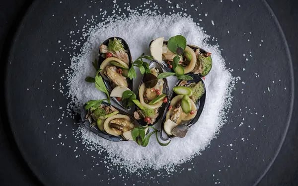
Don’t forget to take into account any special additions to the plate itself! You can get creative here if you want; an addition of a Himalayan salt block or some herb butter on top? Delicious, but definitely an extra cost to add to your final menu price.
If you are an online storefront you should take into account your accepted payment methods. Many online stores use PayPal or other online billing services. Online billing services can usually take a certain percentage of an individual sale, though this is minimal.
Step two: Create a system for portion control
Most successful restaurants have a well-thought-out system for portion control. Both the kitchen and management know exactly how much food is being used per plate. For example, take the almighty filet mignon plate we suggested before. What if you used approximately 2 roasted carrots per plate?
You can take it into even more depth here: measuring meat portions and buying pre-portioned food items. This can run from chicken breasts to the dough and can cost extra.
It’s up to you to decide if this extra cost is worth enabling better portion control and minimizing food waste. Some of the best restaurants have always purchased pre-measured food items, and did not sacrifice quality in the process!
Want to know exactly how much food to order for your restaurant? Utilizing a restaurant reservation system can help estimate the typical flow of customers through your business, allowing you to predict exactly how much of each ingredient you need to order.
Step three: Highlight specials and seasonal dishes
This is where the real fun can begin and where you’re creativity is allowed full rein! What is your restaurant known for? If you’re not established yet, what do you want to be known for?
If you haven’t created a theme or concept yet, brainstorm!
This is vital in the process of deciding what dishes you want to put on the menu that will promote your restaurant’s culture and create loyal, happy customers. Experiment and collaborate with your kitchen, and cultivate talents through this process. This is the point in menu engineering that is not only the most fun, but also a point that can make your restaurant stand out.
Create a story through your dish, and allow your customers to get to know it.
I once worked for a Ritz Carlton restaurant where we served a Chicken Coq A’ Vin entrée that highlighted the skills of one of our chefs. It was an original French recipe passed down through generations, and it was special!
Though it was the most expensive item on the menu, it was the best seller. Soon enough, there were people that came in asking for this item every day. Our chef would come out and talk to particularly interested customers about the dish, and even share the back story.
This created a story that people could be a part of, and also made the kitchen proud to share it. Powerful choices when creating a menu can not only bring in business, but truly nurture a growing culture in your restaurant. Sometimes there is more than meets the eye.
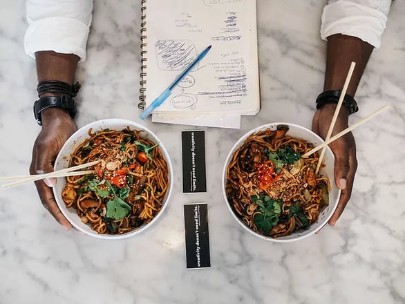
Be sure to pay attention to any exotic dishes and highlight them accordingly. Say for example, you serve pork ramen. Instead of displaying it as such, you could use Tonkatsu Ramen, it’s original name, to highlight it within the menu. Or one of my favorites, fried Indian Samosas. You could embellish this item by listing it as Paneer Amritsari.
Don’t forget to include a description and origins of the dish (more on this below)! This is sure to arouse customers interest and curiosity. However, it’s important to give people in-depth descriptions of items. Not all people are so adventurous!
Use enticing, descriptive adjectives in your menu descriptions.
Another example here; take a Cheesecake as one of your dessert options. Do you list this simply as Cheesecake? Twice-Baked Cheesecake? Red Velvet Cheesecake? No! Get more descriptive, with what you notice upon tasting this item. Is it tangy with layer of graham cracker for the base? Does it have notes of cinnamon? Any special ingredients used in the process are a must in including on your menu description.
A great example for this could be: Velvety smooth cheesecake with a tangy layer of cream, graham cracker base with a hint of cinnamon. Sounds mouth-watering right? Be sure to include origins of your dishes, inspirations, etc. (Remember the Coq A’ Vin from above). This makes the customer believe they have more power of their choice, and that they are also getting more for their money. Descriptions shout authenticity, which is another huge plus!
It is especially important to include descriptions in an online menu. There is no waiter to answer questions, nobody from management or the kitchen who can cue you in on special items used or the story behind a particular concept.
Step four: Organize your menu layout appropriately - the paradox of choice
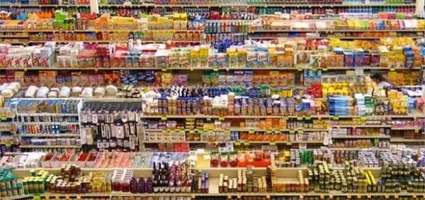
It is important to take consumer psychology into mind when creating an effective menu. Most people are overwhelmed when they have to choose from a wide array of options. If you are a dine-in restaurant, limit your menu to three to four items per food category. You can even limit your salad options to two if need be!
Entrees should be kept to around three to four as well. Many customers experience anxiety about the decision-making process, and go to restaurants to have people suggest choices for them. Important note: This is when you can up-sell menu items. If you are an online storefront, make your menu options clear, concise, and easy to read. A drop-down menu works well, or describing sides that come with a dish in the description works too.
When placing items on your menu, place your most expensive toward the top right corner. Most people make up their minds within the first few seconds of glancing at a menu, and this top right corner is prime real estate.
It’s also important to note that you can use price decoys when creating a menu. People think they are being “thrifty” in buying that $50 dollar steak when there is an option for a $200 Peking Duck Platter listed above. Recent studies have also revealed that the use of dollar signs deters your customers from pulling the trigger. Instead of listing the chicken breast at $23.00, try listing it at 23.
Step five: Choosing a color scheme/presentation within the menu
Color makes the difference! Did you know that blue and green stimulate calm and well-being? This is certainly something to take into account when allowing your customer to make informed choices on menu items. It is also shown in studies that red stimulates appetite, while yellow pulls in our attention. This can be applied to a physical menu or online. I’ve seen quite a few online restaurants that use yellow for their pricing/ordering buttons and red fringe colors.
Use high-quality pictures of your dishes. Emphasis on quality here. Take time out to have a photoshoot with the items you plan on displaying, with all sides and garnishes included. This is another opportunity to get creative and collaborate. Images trigger emotion, and this paired with an enticing description is sure to win.
That's it. You know have the building blocks you need to create an effective menu strategy at your restaurant. Start with the numbers, then get creative and start making your menu shine.
Want to learn more about designing a successful restaurant menu in 2018? Check out this article from buzztime!


-1.png?width=1812&height=1072&name=TripAdvisor%20%26%20More%20Bookings%20(1)-1.png)
-2.png?width=1812&height=1072&name=Google%20Bookings%20(1)-2.png)
-1.png?width=200&name=Untitled%20design%20(21)-1.png)
.webp?width=200&name=Chit%20Printer%20Banner%20(8).webp)
-1.png?width=200&name=TripAdvisor%20%26%20More%20Bookings%20(1)-1.png)
-2.png?width=200&name=Google%20Bookings%20(1)-2.png)
-1.png?width=200&name=Instagram%20Bookings%20(1)-1.png)
-1-png.webp?width=200&name=Facebook%20Integration%20Rectangle%20(1)-1-png.webp)


.webp?width=200&name=download%20(1).webp)
%20(1)-2.webp?width=200&name=Eat%20(34)%20(1)-2.webp)
%20(1)-2.webp?width=200&name=Eat%20(18)%20(1)-2.webp)


%20(1).webp?width=314&height=175&name=Eat%20(53)%20(1).webp)
%20(1)-1.webp?width=314&height=175&name=Eat%20(45)%20(1)-1.webp)
%20(1).webp?width=314&height=175&name=Eat%20(29)%20(1).webp)


.webp?width=144&height=72&name=Eat%20App%20Logo%20(3).webp)